Marcus by Goldman Sachs (UK)
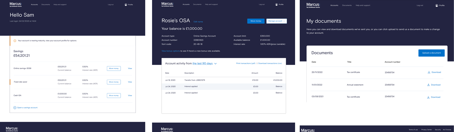
Savings dashboard uplift
How I led the UX writing and design work on the logged-in browser experience which took place Nov 2022-Jan 2023.
For context, I was interim UX writer and UX designer after the UX manager left from October 2022 - June 2023.
So, what was the problem?
Business need
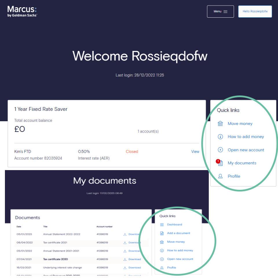
The business was considering building extra products (housed on a different platform), and asked for 'Quick links' to go as it wouldn’t scale.
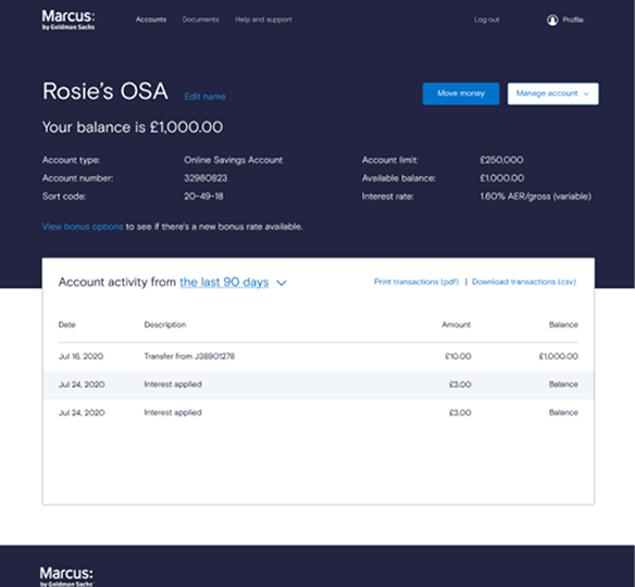
‘Quick links’ appeared on the main dashboard, the account level pages and documents page.
The feature acts as a shortcut for users to get around their Marcus account on a browser.
What did the data say?
When I received a ticket outlining the pages impacted by ‘Quick links’, I set up a kick-off to review the data, scope, and initial ideas. I worked with our analytics lead to understand logged-in behaviour, piecing together insights from device type, page views, call volumes, bonus uptake, and email flows – even though tagging was limited and funnels weren’t available.
I flagged gaps in tracking to the product lead, ensuring future updates would capture this properly. At the same time, I dug into customer context and past call trends, combining quantitative insight with Ops intelligence to understand how ‘Quick links’ were actually used and where changes might drive friction.
How can we make using Marcus simple?
I worked closely with the Deposits Product Manager and Product Lead to make the logged-in Marcus experience simpler, building upon Marcus’s core promise – saving with ease.
With a fixed number of sprints and a clear brief to deliver an uplift rather than a redesign, we focused on small, low-risk improvements that reduced effort without disrupting what customers were already familiar with, especially important given most people access Marcus via web.
In reviews, I helped move the conversation beyond surface-level tweaks by asking simple questions like ‘why does this help?’ and ‘where does it support the journey?’ This kept us focused on clarity and reassurance for customers, and led to designs that were iterated collaboratively in Figma, balancing customer needs with delivery constraints and commercial goals.
Advocating for better bonus experience
To ensure we made the most of this uplift and ultimately reduce calls, I proposed a bigger change as there were two issues I saw on our existing account page:
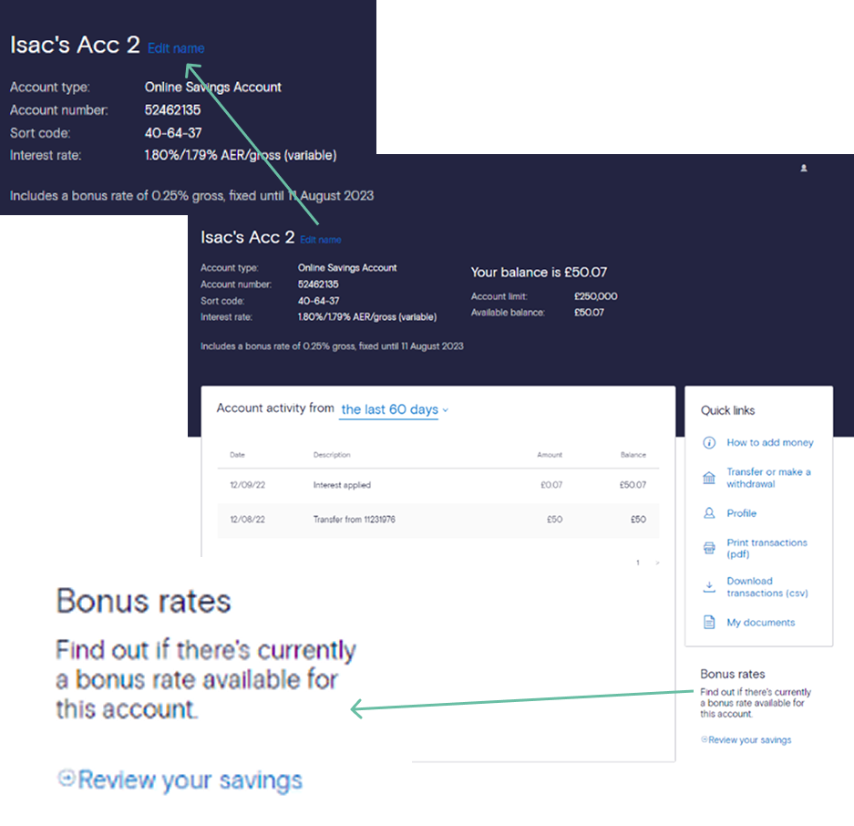
Edit nickname as this link inaccessible on browser. Thankfully not on app.
Bonus and renewing it.
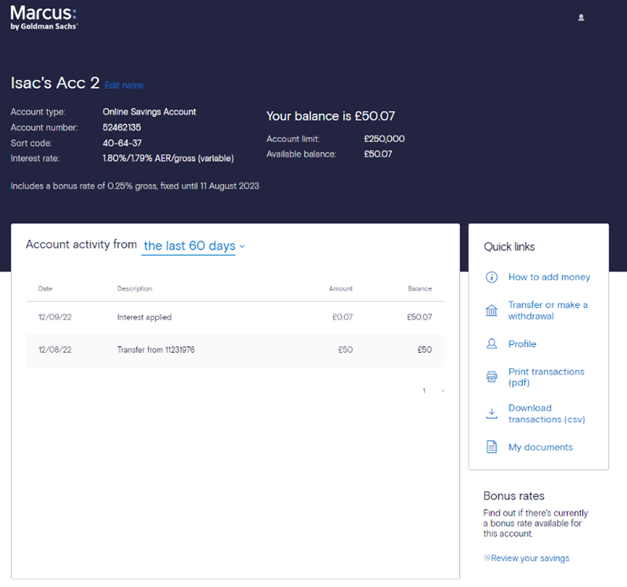
Adding a bonus to your Online Saver Account or ISA is a USP for Marcus. It’s a way to lock in an extra amount of interest for 12 months, and you can renew it at any time. Marcus automatically adds it to your account when it first opens, but it’s then on the customer to re-add.
We’d always get calls about how to add a bonus - spikes for expiry and when we increase the rate. On the existing page, it appears right at the bottom and in mobile browser view, this appears right at the bottom of the page, so easier again to miss.
I also had questions about the wording - there’s only a sole bonus rate available, and why the link and then generic wording.
Advocating for a better ‘bonus renewal’ experience
I focused on reducing confusion and improving find-ability of account actions, particularly around managing bonuses, by advocating for clearer structure and more explicit, customer-led language.
I challenged generic labels and pushed for wording that reflected a customer’s actual situation, helping teams think beyond surface-level UI changes and towards clearer decision-making and support outcomes.
While scope constraints limited how far the solution could go, this work influenced how bonus actions were surfaced, improved consistency across web and app, and led to a dedicated initiative to test clearer bonus language—creating space to learn and reduce ongoing customer and agent friction.
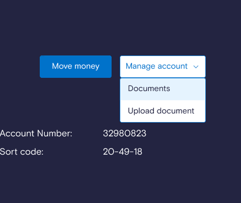
To create a clearer, more intuitive account experience, I proposed a “Manage account” dropdown to house secondary actions, such as editing a nickname, renewing or adding bonuses, and accessing documents, without distracting from the main task of moving money.
I explored dynamic wording to make bonus actions clearer and aligned the browser experience with the app for consistency, challenging assumptions and testing how language could reduce confusion.
While scope and delivery constraints meant we kept a simpler solution for launch, my input shaped the approach, frontloaded “View bonus options” for clarity, and secured support for a separate initiative to test bonus wording—creating a valuable opportunity to learn how customers understand and act on one of the bank’s most unusual manual journeys.
Solidifying hierarchy for approvals
Proposed changes:
Updating main navigation bar
Reading your balance is the most important information to read - shifting this over to the left
Move money is primary action
New ‘Manage account’ dropdown to house other links
Renew bonus needs to be prominent - colour concerns
Placing ‘print transactions’ and ‘download transactions’ to right above the account activity
Leading sign-offs
Working in a highly regulated, multi-stakeholder environment, I took a lead role in bringing second- and third-line teams (including Ops, Legal, Compliance, Privacy and Tax) along early, knowing sign-off depends on trust and no surprises. I chaired our twice-weekly Content Approvals Group (CAG), helping teams work through trade-offs, challenge assumptions, and land on decisions that balanced customer impact with risk and delivery constraints.
What changed?
When getting sign off for the screens so they could go on usertesting.com, there were two discussion points about the manage account drop down.
Firstly, ‘what to house in there?’ conversation was around fears of it becoming too crowded, and that ‘edit nickname’ despite not meeting contrast needs, didn’t get much customer feedback and many could successful change their nickname - mainly on app.
So it was asked that that field gets removed.
Secondly, Ops wanted ‘Documents’ and ‘Upload a document’ so customers can skip a page and go right to point. I challenged by saying on the proposed document page we are adding a new upload doc CTA, but they really wanted to minimise anything extra.
Testing and results
We tested the main journeys:
Log in and view dashboard
View account information
Move money
Renew bonus
Download transactions
Find tax certificates
Users liked the minimalist feel and thought the language was clear.
Successful journeys:
Move money - 100% success rate
Download transactions - 93% success rate
Find a tax certificate - 93% success rate
Account design feedback:
Respondents mainly positive
Challenging journeys:
Renewing a bonus performed the worst, with 47% of users saying the task was difficult.
Balancing change with call volume concern
Post testing and whilst build had started, Ops raised concerns about the risk of increased calls and whether agents would feel confident supporting customers through the changes.
This is where I leaned into a core UX skill - balancing empathy for users with empathy for stakeholders. I acknowledged their concerns, then grounded the conversation in evidence from testing and wider changes that I was completing to support the change. For example, FAQ + I wrote a new targeted email that linked out to a new page creation summarising changes and reviewed agent ‘Talking points’ and took the team leaders through the screens.
By reframing the change in the context of what customers already see and what agents already support, I helped reduce anxiety, maintain confidence in the solution, and move us through final sign-off without reintroducing unnecessary friction.
Successful launch
Went live end March 2023
No real change in call volumes based off changes
75% CTR from marketing email to webpage
I made business case for bonus renewal journey recommendations, which have been added to the backlog
When a bonus increase happened end of April, we saw 79% uptake (over 4 weeks)
Finish getting all the CTAs and links tagged up (was completed post launch)
Abilitynet review to further aid colour issues