Chase UK
Uplifting Chase UK transaction pages to reduce contacts
How I led the content design strategy for Chase transaction detail pages - reducing calls by 16% and chats by 22% while maintaining customer satisfaction.
So, what was the problem?
For the business
On average, 60% of all contacts to Chase came from the transaction detail pages. Out of these contacts, 26% of help given overlapped with existing FAQs. With potential savings of £900,000 annually, there was a clear business case for improving self-serve capabilities from the transaction detail page.
For customers
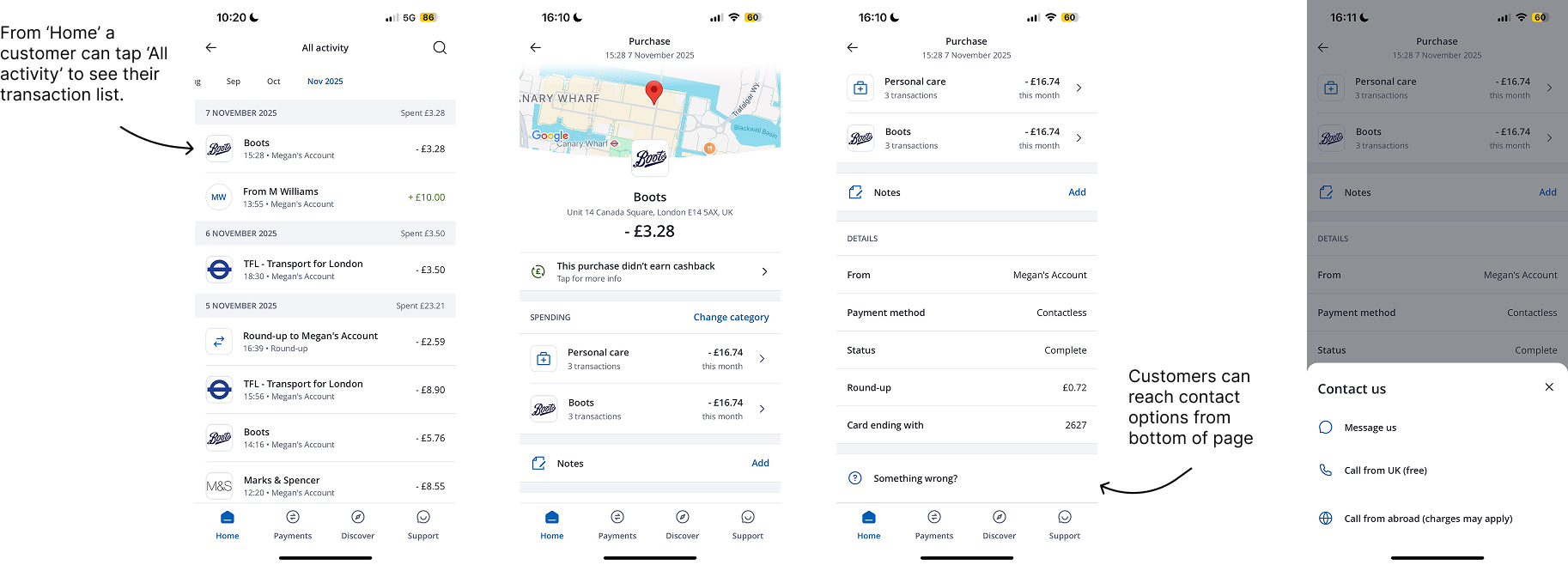
Users viewing their transactions might be opening their transaction details to check a certain detail, e.g cashback, but a large majority often felt confused, stressed, or worried – especially when something looked unexpected. The existing pages showed transaction data, but offered no guidance other than to contact.
Constraints and considerations
Regulatory
Consumer Duty requirements mean content has to genuinely help customers understand their options — not just support business goals of deflecting contacts. We needed to be careful not to remove legitimate paths to support.
Tone
Customers checking transactions were often worried, in a time sensitive situation, or looking for clear answers. The content had to reassure quickly – without being vague or sending people down unnecessary paths – so they could act with confidence.
Technical
FAQs needed to surface dynamically based on transaction type and status. A pending purchase requires different content from a completed refund or declined payment.
Stakeholders
Multiple teams need visibility of this and input: payments product, CX, legal, compliance, accessibility, risk, and engineering. Content required alignment and sign-off across all of these.
The process
Research and discovery
I started by analysing call and chat logs with the banking operations lead. This helped uncover the most common questions and trends customers had about transactions.
I also used this to be a buy-in opportunity; if being in the servicing squad has taught me anything, it’s that we can’t just pat ourselves on the back once front-end changes are deployed– these affect banking operation teams heavily too. I was keen to utilise their thoughts on where we could win by adding content here and to give them foresight on the uplift. Call centre teams are ultimately our frontline staff and have a suite of guides and processes. We needed them on board and aware that changes were coming to a key touch-point.
Engineering
In parallel, I began working with the payments team and engineering to understand:
Is our figma file up-to-date?
What are all the activities a customer can see?
What are all the statues linked to these?
What instances do we notify customers of a status change or activity type? e.g declined or cancelled
The file was not up-to-date, so engineering supported by recreating all possibilities in-app. It turned out there were lots more than first thought.
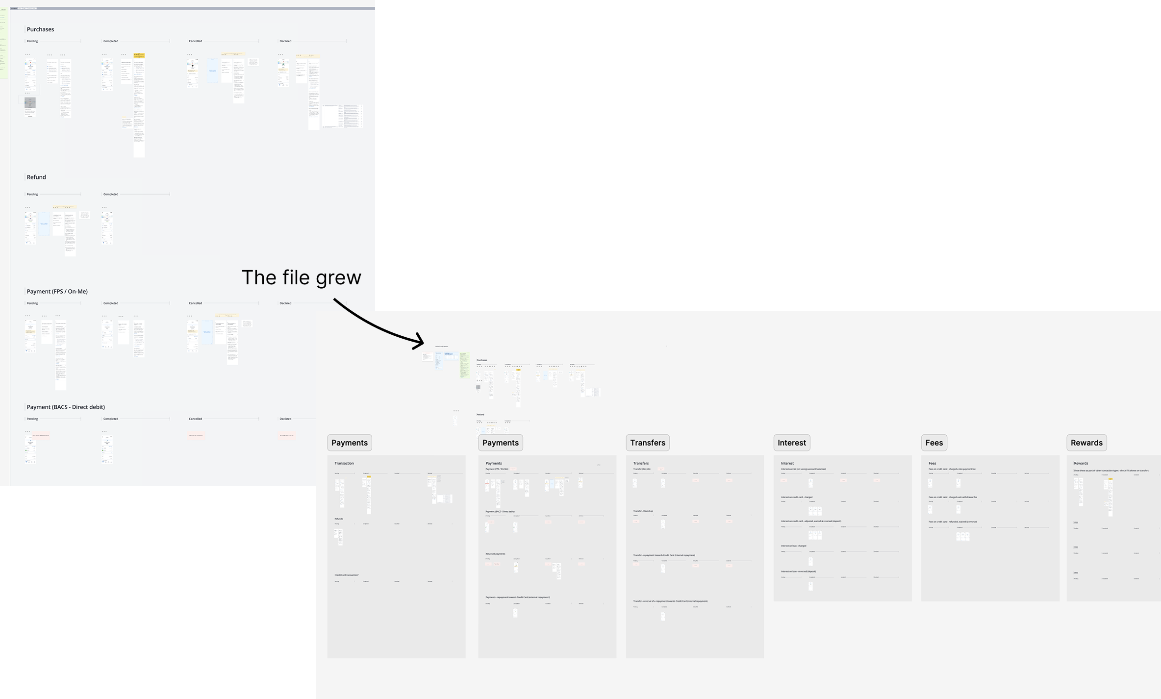
Moreover in doing this, I was able to see where similarities lie. Maintaining this volume of content would be tricky – individual questions per status which are all republished via app releases. I've learnt through Chase that you need to pre-empt as much as possible. Engineering resource is precious.
Where could topics be combined? Which answers could be covering a few topics? There were a few wins, for example, combining 'Refunds, cancelled and returned' payments as a lot of the reasons, timings and definitions overlapped.
Certain transaction statuses related to 'cashback' and other topics too, so starring subjects that relate to many as a way to neaten up how I could write those answers in a way that would suit different transaction types.
Content audit and mapping
I audited existing help content and identified gaps. Some FAQs already existed in the ‘Support tab’ but weren’t surfaced at the right moment due to our search mechanism. Others needed rewriting — they were written for a general audience, not someone staring at a specific transaction.
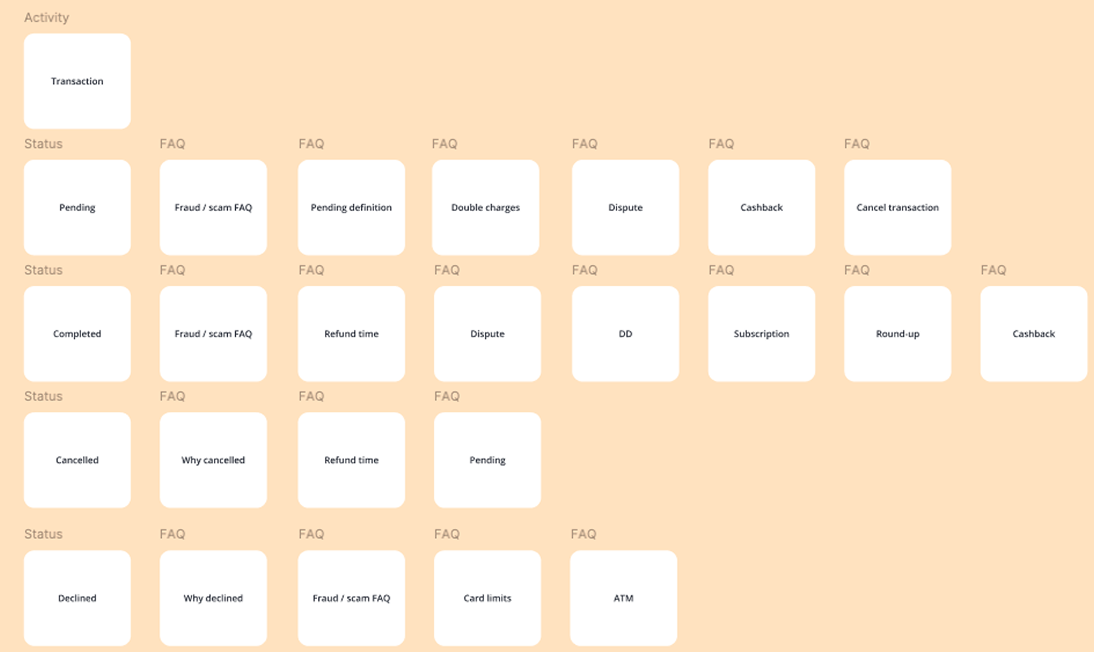
I created a content matrix:
Transaction types (purchases, refunds, payments, Direct Debits)
Statuses (pending, completed, cancelled, declined)
The most relevant FAQs for each combination
Iteration
Using Chase TOV principles as the basis personable, plainspoken and proactive. I started drafting each topic into a question that's a) easy to scan b) is phrased a way a customer would phrase it c) indicate there is a resolution in the answer.
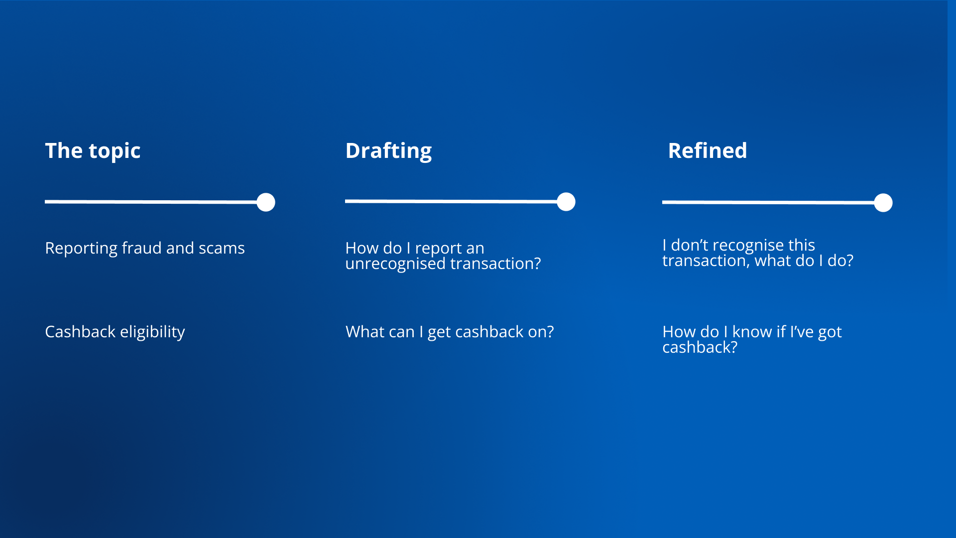
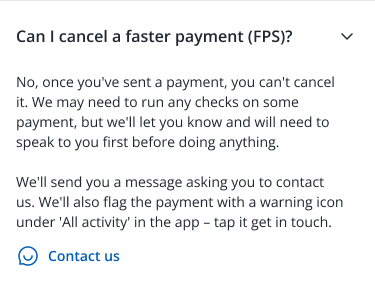
Example: Unrecognised transaction aka fraud concern
For topics where there was more potential for customer harm, it was crucial to ensure the content didn’t add friction but offered support. This was most important for when a user could be think they’ve lost money to in scam or from fraud.
We have research showing that our users don’t like to think of themselves as ‘victims of fraud or scam’. This is down to different elements - a bit of ego, but also fear. It’s a delicate topic. So how can the content be robust enough to sound calm, encourage the user to follow precautions and show we’re on hand.
I drafted this a few times, and here’s a before and after:


Now there’s not been massive changes. But the opening has become less patronising (obviously you’re worried or midly concerned if you don’t think you’ve made a transaction you’ve been charged for) but it’s also more proactive. It’s letting the customer know there are well thought of ‘steps’ you can quickly action to ensure your account is safe.
I was confident that the opening, coupled with the easy to glance at steps, was a manageable and snappy format. The CTA became more descriptive too - in the moment customers can become clouded if they’re panicked, so letting them know the way they can report it upfront highlights Chase are still on hand for them.
This design – text with CTAs to reach Chase – helped ease wider concerns for stakeholders who initially interpreted the brief as Chase blocking contacts, which isn’t the case. I walked them through the rationale why I had included the specific questions on each status type, along with current contact rates to show that there is a case to have customers understand more of how the bank dealt with their money so they could see it was normal. And then if the answer wasn’t enough, they could contact from one further level down.
Bringing it all to life
Between having peer-reviews, a wider CX and engineering sizing the uplift was coming together.
I felt assured that what was being prepared for legal and compliance review, also known as Line of Defence (LOD) review internally, wouldn’t have too many objections.
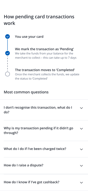
What’s more, is that the designer and I were able to create a new timeline component (far right) for the ‘How pending card transactions work’ status page. Normally, it’s hard to have new components added to the library, but due to a monthly average of 27% of calls being related to pending transactions, we pushed for it with our hypothesis being it highlights the process best compared to just plain text.
Line of Defence (LOD) review
The majority of FAQs had minimal and understandable comments e.g checking if all issues listed were the total possible issues, some language changes to make things explicit like SLA times for disputes.
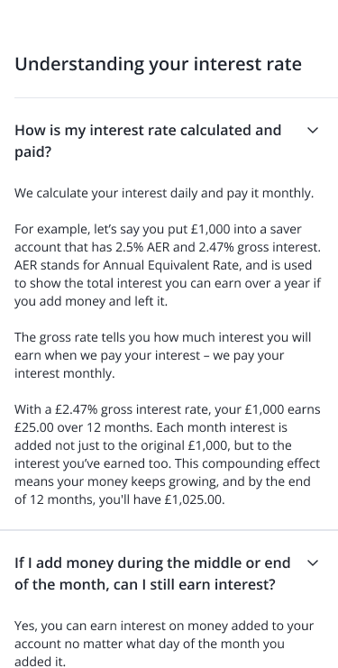
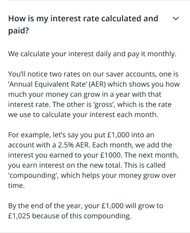
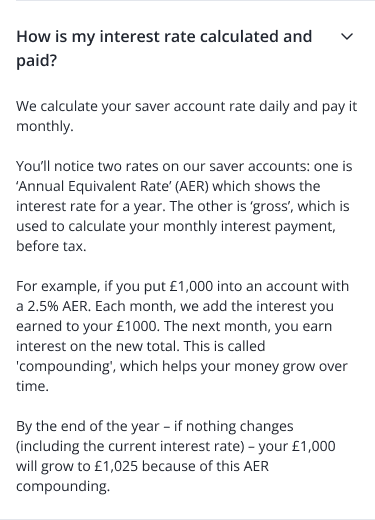
There was one fallen solider though, and that was an FAQ on ‘How is my interest is calculated and paid? for the ‘Interest’ transaction detail page (which comes monthly when Chase add the interest earned to a customer’s account).
As the Chase saver rate is tied to the Bank of England rate, the numbers can be confusing and we regularly had calls on this - 11% monthly average.
To mitigate this, I proposed an uplift to the wording held on the website. However, due to phrasing in the Terms and Conditions on how we defined interest, having an alternative meaning else where would mean we were contradicting that. Legal weren’t up (I can see why) for updating the T&Cs wording else it would result in notice of variations for customers. I didn’t know this was the case before starting this copy. This question didn’t make the cut. You can see on the below how I started vs how it ended.
Impact and outcomes
Experiment results
We ran an initial experiment showing contextual FAQs to 10% of customers viewing pending transaction pages for one month.
16%
Reduction in calls
Customers found answers without needing to call support.
22%
Reduction in chats
Self-serve content resolved questions that would have become chats
No drop in CSAT
No increase in unresolved contacts. Customers weren’t being deflected — they were being helped earlier.
What’s next?
This is due to go live March 2026.
I’ve updated all comms and sign-posting to reflect the new look. I’m excited to see and monitor the savings this translates into for the business, as well as seeing the wider customer reaction so I can iterate the content and increase self-service for our users.